NCREIF Farmland Data Unpacked, Appreciation vs. Cash Returns
by Matt Harrod
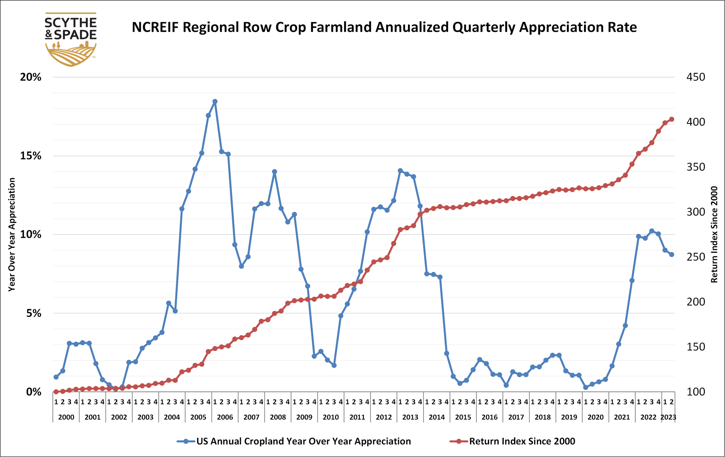
Based on questions and feedback on the previous NCREIF appreciation chart and post, we thought we should provide some additional information and perspective as to what these figures are and are not.
First, these particular figures and charts, as in the previous post, are only looking at US row crop farmland value appreciation, specifically the rate of appreciation on a quarterly basis, which does not include income and returns from cash rents or other sources (the CAP rate). Much like dividend income from stock ownership, we would need to add in the income return to calculate a total return. However, it’s important to look at value appreciation and the CAP rate separately to better understand how much the underlying asset (row crop farmland in this case) is appreciating vs cash returns to that asset. This is especially important when appreciation rates are cyclically high, as they have been since mid-2021, in order to better understand current land prices and expectations in forthcoming quarters.
Second, reduced rates of appreciation such as was experienced from 2015 – 2020 does not equal a loss of total land value or correspondingly its’ value per acre, so long as the rate stays positive. To be sure certain regions, such as the corn belt and the Mississippi delta, saw some slightly negative values between 2015 -2020. The chart above and our post last week reflect US row crop farmland as a whole, and, from an investor perspective, can be viewed as what a portfolio of land holdings across a portfolio of regions might looks like.
Specifically, this chart is a look at annualized quarterly farmland value returns and its index since 2020. The blueline is annualized quarterly returns for each quarter, meaning the sum of that and the previous three quarters individual appreciation rate vs the quarter immediately proceeding it. The redline is an index, or a look at the quarterly value of US row crop farmland relative to Q1 2000. So if we use the value of row crop farmland in the US in Q1 2000 and make it equal to 100, and then adjust it each quarter according to that quarter on quarter appreciation rate, we can see how much that theoretical acre value has changed over time. We can see that although the rate of increase has varied, the redline as of Q2 2023 has never gone down/decreased and is about four times higher than it was in Q1 2020 (100 * 4 = 400).
Finally, why are we using NCREIF data and not USDA figures? First and foremost, the NCREIF data is utilizes reported returns of NCREIF members, which tend to be institutional pension funds, very high net worth individuals, university endowments, funds managed by asset managers, etc. This group is focused on relatively highly productive “investment” grade farmland and so reflects that segment of farmland, whereas USDA returns are broader and include all levels of productivity as well as small parcels, the value of which can be skewed by lifestyle purchasers, local social dynamics, etc. Secondly NCREIF data is more granular than USDA data in several ways, including quarterly reporting vs annual, segmentation of row crops vs permanent, etc. All of these combine to give us a more precise view of what is going on in the farmland market with an eye toward long term investors.